I’m not a designer, and by no means am I trying to become one.
The objective of color is to highlight the information, and highlight is building contrast. I use 3 colors in my slide: grey, black, and one primary color. More colors requires more skills to maneuver, so I rarely do so unless I’m out of option.
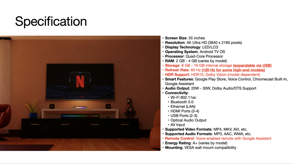
Make the important information standout is the obvious approach, but it gives little room to highlight before red text, bold, italics, boxes, and arrows are added for indication.
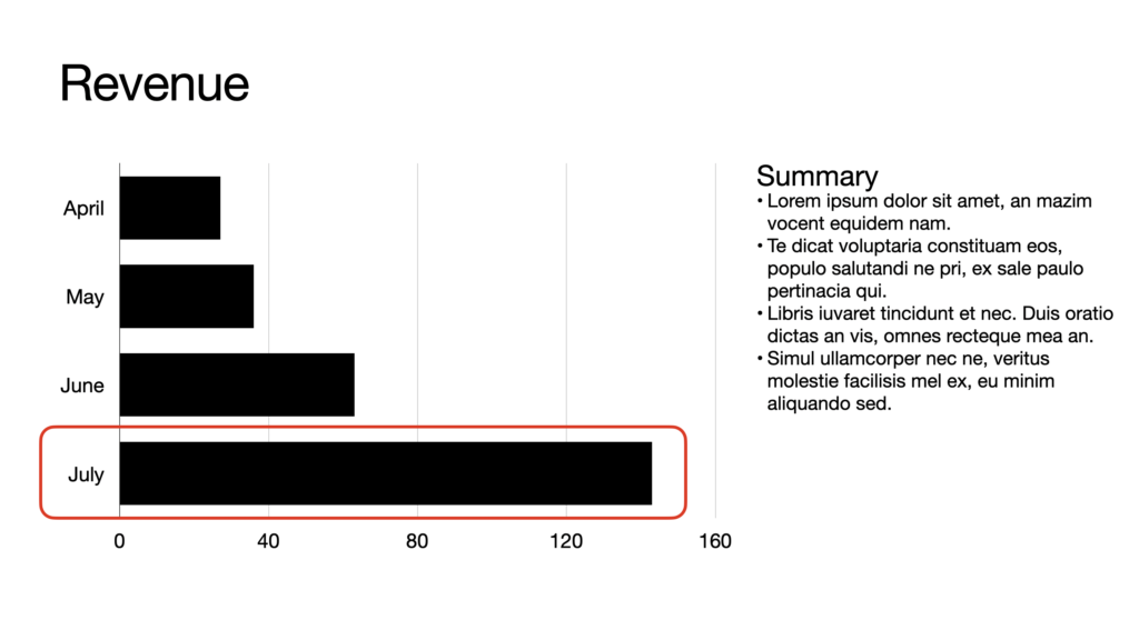
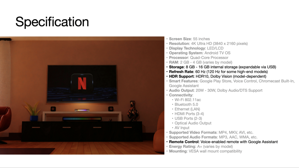
Reduce the secondary information is the less apparent approach, but it’s often times simpler. Keep the important information as is and reduce the attention of secondary information with grey.
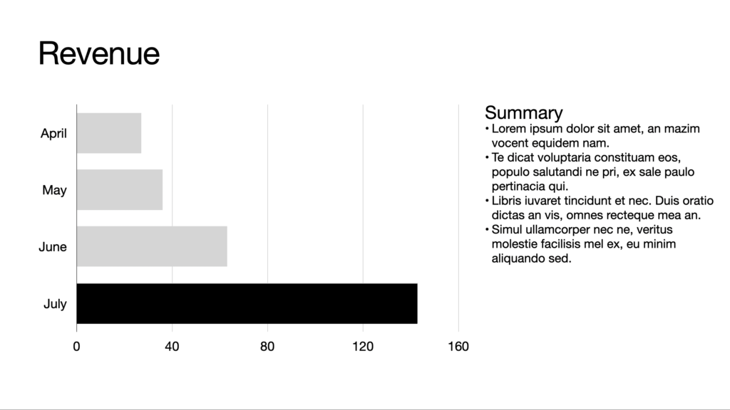
This works for general reports, which is usually mix of words and graphs, or any other simpler document.